

data reportingdata studioData VisualisationGoogle Data Studionew features
Five of the Best New Features in Google Data Studio
There has been a whole range of new features added to Google Data Studio throughout 2021, with many of the updates and additions offering improved usability and a streamlined experience...


There has been a whole range of new features added to Google Data Studio throughout 2021, with many of the updates and additions offering improved usability and a streamlined experience when it comes to building data dashboards and reports. As is often the case with Data Studio, it can be difficult to stay on top of all the updates, especially if you’re not working on the platform on a day-by-day or week-by-week basis. Here are five of the best new features added over the last year.
Draft Mode and Publishing
Draft Mode and Report Publishing were added to Data Studio in early 2021, allowing you to work on your dashboard without all changes being immediately public. This meant that viewers would no longer see tables, graphs, and other widgets moving around the page in front of them. The additional control available to the report editor was hugely significant.

Drop Down Menu for Draft and Published Versions
This update also introduced an improved Version History menu: a tool that allows you to revert to previous iterations of your dashboard, just as you would expect in document or spreadsheet editing. The Version History menu was not only easier to use, but also allowed for previous versions and publications to be named, rather than relying on timestamps to identify different builds and iterations.

Version History Menu in Data Studio, including Named and Published Versions
Interact In Edit Mode
The ability to interact with your reports while in Edit Mode is one of the more understated additions, but may be one of the most useful. This allows an Editor to use the interactive aspects of a Data Studio dashboard, just as you would in View Mode. This is hugely convenient when it comes to both tinkering with your reports, and analysing the data.
You’ll now notice an outline and a shadow-like banner surrounding your widgets when you hover over them in Edit Mode. If you want to click on a widget to move it, or make an edit to the data menu, you can click on the outline. This will select the widget to Edit, rather than “interact” with it. You’ll find this particularly useful for drop-down menus, date selectors, and widgets with cross-filtering applied. There’s not much else to say about this new method of interaction, it works exactly as you would expect.
Improvements to Page Options
The options around the structuring of Data Studio’s dashboards had remained static for a few years, only really allowing for the page list to be shown on the left of the interface or as a drop-down menu. This was fine if you were familiar with the platform, but a bit clunky for newcomers. Thankfully, several new features were added to the page set-up in October 2021, allowing you to add Sections, Dividers, Headers, and even Icons to your page lists.

Page list showcasing Dividers and Headers for both Edits and Viewers
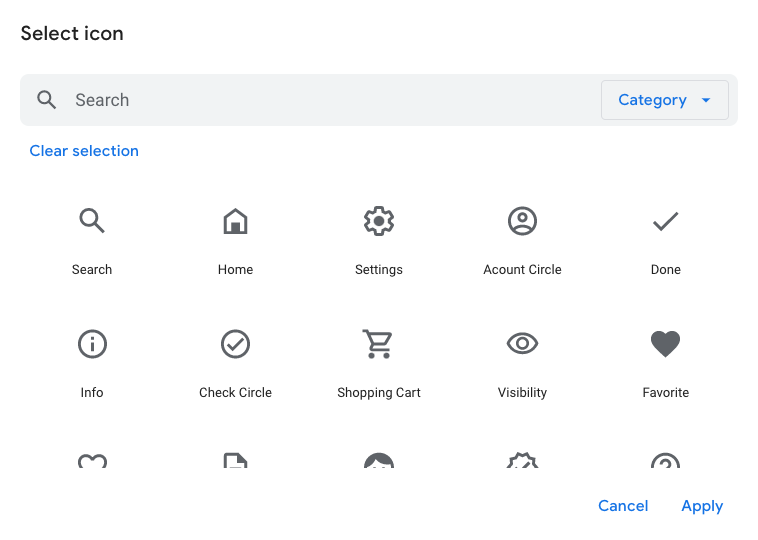
Select Icon menu on Data Studio
These may seem like fairly minor additions, but are significant tools that can be used to help create effective and efficient data dashboards. As always, improved user experience means more time and effort can be spent on analysis and decision making. You can find out more about the improved Page Options here.
Tab Navigation Layout
We think the additional page options above are best utilised alongside the Tab navigation layout, as these two features really compliment each other. The Tab style is the most intuitive layout for dashboards, as it replicates the user experience of typical website design. The Tab style is particularly useful for dashboards with fewer than 10-12 pages. Even better, you can now colour the navigation to compliment your report!

Tab Navigation in Google Data Studio with theme colours and page icons.
GA4 Support and Integration
While many of the releases on Data Studio throughout 2021 were geared towards user experience, perhaps the most important additions have been the inclusion of more fields in the Google Analytics 4 connector. There were some curious omissions when GA4 was first integrated with Data Studio, but thankfully it looks like the team are introducing many of the dimensions and metrics we’d come to expect. This is crucial if we want to take Data Studio along for the ride as we all make the move from Universal Analytics to Google Analytics 4.
Some of the new fields added include Acquisition breakdowns by Session and by User, Event-scoped Campaign dimensions, Page path dimensions, and a breadth of Ecommerce fields. If you’re not seeing any of these in your GA4 data source, don’t forget to refresh the data fields in your data source. You can also use the Reports Snapshot report in GA4 to view the usage data of your dashboards.

It’s Never Too Late To Get Started
It’s encouraging to see a consistent level of support with a huge number of updates to Data Studio throughout 2021, with many features providing small but significant improvements to the Data Studio interface and platform. There’s never been a better time to jump into the world of data visualisation. We look forward to seeing what awaits in 2022!
You can find a full list of additions to Google Data Studio in 2021 on the official Release Notes. For more on Data Studio and Digital Analytics, check out the GlowMetrics blog. Please feel free to ask a question or leave a comment below, or contact us at contact@glowmetrics.com. You can also follow us on @GlowMetrics or subscribe to our newsletter for more tips and news within the world of Digital Analytics and Marketing.

Posted by
Conor Ross
Conor specialises in data visualisation, designing and creating bespoke data dashboards and automated reports with Looker Studio. With a background in Psychology and Research Methods, he also works on projects focused on improving customer experience and website usability through A/B Testing and Personalisation.
Read more from Conor RossBrowse by Category
- Social Media
- SEM
- SEO
- Google Ads
Digital Marketing
- Google Analytics
- Google Tag Manager
- Google Opimize
Digital Analytics
Optimise your website and marketing campaign performance with Ireland’s leading digital analytics agency
Sign up to our newsletterEnjoyed reading this article? Find more like it below…
Posted by
Conor Ross
May 11th 2021
Google Data Studio
6 min read
Page Navigation Options in Google Data Studio
The structure and layout of your Google Data Studio dashboards are massively important aspects of data visualisation, as these provide the framework for users to navigate your reports. There’s no...

Posted by
Conor Ross
Oct 6th 2020
Digital Analytics Insights
3 min read
Data Studio Showcase: Formula 1 2020
Data visualisation is fast becoming one of the most important aspects of driving a data driven decision making process, supporting the presentation of key statistics and important information in a...

Posted by
Kyle Crooks
Dec 21st 2023
Digital Marketing Insights
4 min read
Granting Access to Assets on Meta Business Manager
In life, we experience many complex challenges. What career is right for you? Should you get a starter, dessert or both? How long do you really need to spend with...
Leave a Reply